2023
Official Portfolio
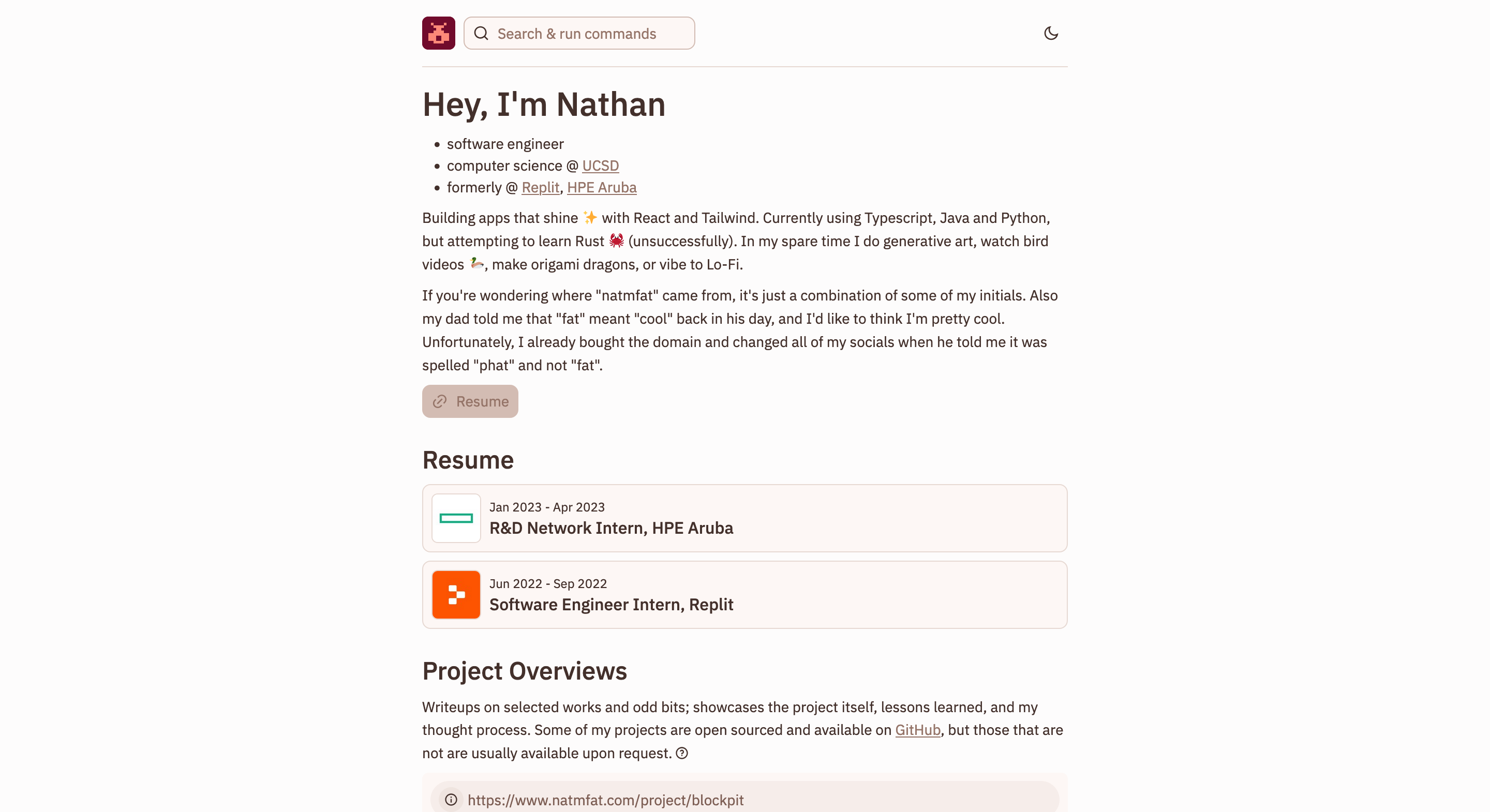
The latest version (version 1.5) of my portfolio, built with Remix and TailwindCSS.Table of Contents
Introduction
My initial portfolio (v1) was built completely with React and Tailwind. v1.5 is somewhat of a misnomer, considering it is less of a simple upgrade and more an entire rewrite with Remix for routing and serving markdown files (which includes the project overview you are reading now). If it interests you, the technology architecture is described in more details later on.Features
You'll have to explore the portfolio if you want to find any hidden features, but the website is quite simple by design - you could reduce the experience to simply the home page, which showcases my experience, basic information about myself, and cool projects I want to highlight. However, my favorite features are all located in the website header. Every time you click on my logo for example, it will bring you to the home page, but it will also randomly change and generate into a new one. This is a little easter egg designed to reward people who explore and interact with the pages of the website (and want to return home). Also in the header is the search bar or graphical CLI (CLUI, as popularized by Replit). In addition to playing homage to my time at Replit, it also allows you to easily navigate to any part of the website and to any of my socials without the boring hamburger menu.
Design
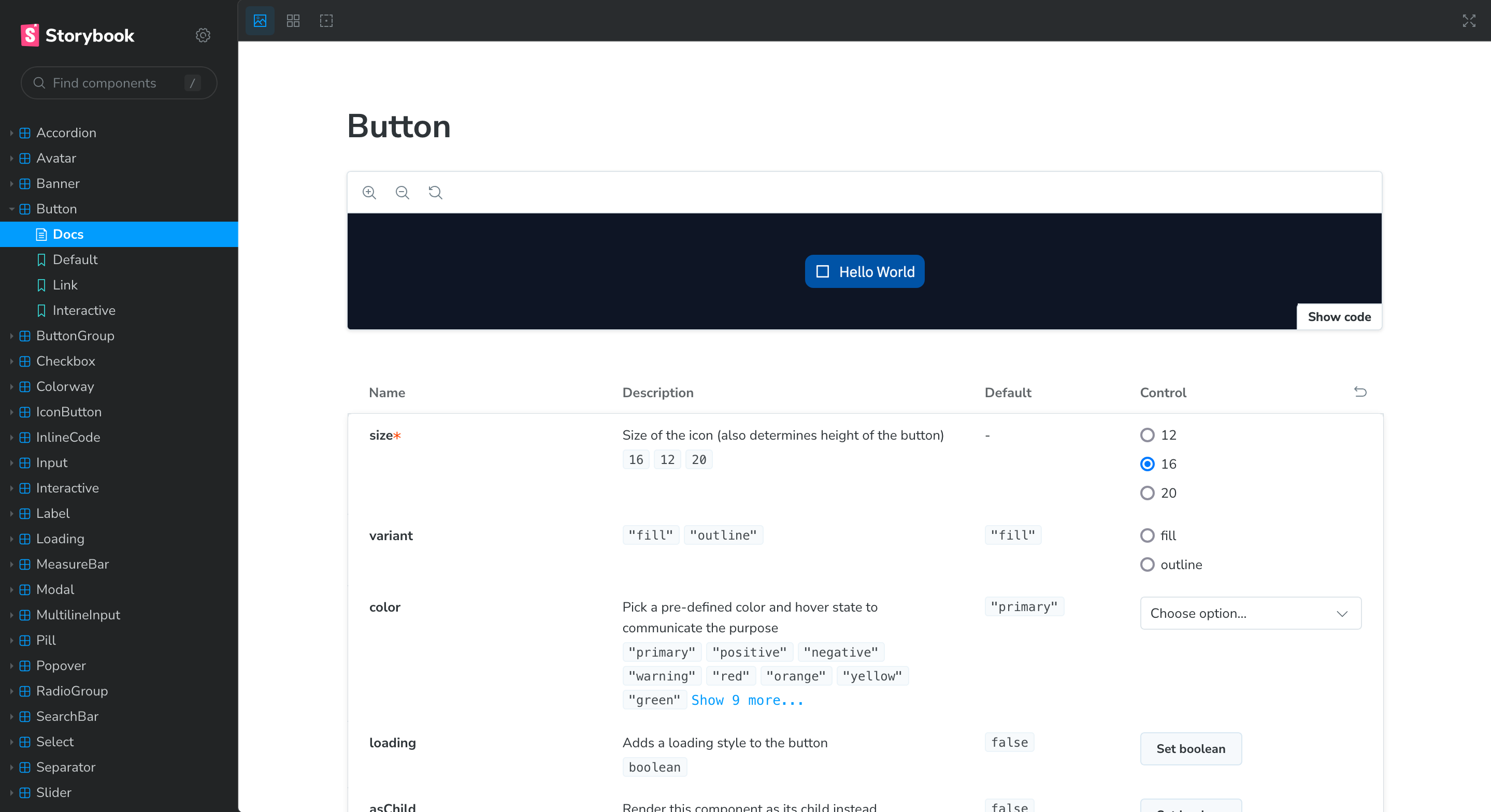
The feel and interactions of components on this website are heavily influenced by my time spent interning with Replit; indeed, I borrow much of their old (late 2023) design language of friendly rounded corners, small easter eggs, and (non-brand) colors. Interestingly, in completing this project, I also completed an accessible design system, with some notable departures:- my components leverage Radix Primitives for accessibility and CSS Modules with PostCSS layers for composable styles; Replit's implementation uses reusable JavaScript "tokens"
- Remix Icon (and Simple Icons for additional technology logos); Replit has custom-made icons
- simple design choices like adding an underline to links to emphasize clickable content

Tech Stack
I'm using a JavaScript framework deployed on Vercel. Obviously the technical architecture isn't complicated. This website is built with Remix (React) with remix-flat-routes and TailwindCSS to "modify" my design system. The Replit-esque design system, as stated previously, is built with Radix Primitives, CSS Modules, Remix Icons and Simple Icons. The way I serve project overviews is both- an interesting challenge
- probably not scalable at all.
import markdown files in a Remix loader given a project "slug". For example, given a project slug of "official-portfolio" (see the URL right now!), the loader will import official-portfolio.md. This should avoid any common problems when deploying with Vercel, where a file system may not be available.
To get all of the Markdown files to show on the homepage, I use Vite's import.meta.glob. This looks vaguely like this:
This is essentially transformed into a series of import statements (as described on the Vite documentation), which would dramatically increase the bundle size for the client. I could add a "server" suffix to each Markdown file to ensure their exclusion from the client bundle, but not only would this get extremely repetitive across many Markdown files, I'm not actually sure if Remix would excludes any files marked with1 2 3 4 5 6 7 8 9export const getProjects = () => { return import.meta.glob<{ default: string }>( "../../_app.project.$projectSlug/projects/*.md", { eager: true, query: "?raw", }, ); };
.server or only JavaScript-related files marked with .server. I decided to simply stick getProjects in a "server" file and retrieve the data in a loader, which solves both of these concerns. Importing more and more Markdown files probably isn't the best idea, but some components and layouts I've worked with have had many more imports so it's probably fine.
Development Process
This was the first time I tried out Zed! It's definitely super snappy and fun to work in. My only complaint so far is lack of MDX support, but ultimately I opted to use plain Markdown instead anyways.Challenges Faced
One of the biggest challenges I faced when building this website and its design system was ensuring components were styled consistently in both development mode and the final build. Using CSS Modules and PostCSS supported layers was critical in creating consistent components. If you're not sure why this is even a problem and why "layers" are necessary, it's probably because it's never been a real problem unless you use a very specific style I'm pretty sure I accidentally invented (If not, send me a DM to correct me!) I use Radix Slots and CVA to apply resuable, type-safe styles in a declarative and composable way. Honestly, that's a bunch of word salad, so here's what that looks like:Here, the "interactive" styles are applied to the1 2 3 4 5 6 7 8 9const IconButton = ({ icon }: { icon: ReactNode }) => { return ( <Interactive variant="outline"> <Colorway color="blue"> <Button>{icon}</Button> </Colorway> </Interactive> ); };
Button component via Interactive (and the "colorway" styles are applied similarly).
I think this is a pretty great (if extremely opinionated) way of applying styles, but the real problem is that each of those "composable" components (including Interactive and Colorway) use CSS Modules, which are scoped and therefore have near-maximum precedence. It's not clear which styles should have precedence - Interactive or Colorway - if there are conflicts.
Using "layers" to explicitly compose styles seems intuitive in hindsight, but not only was it a pain to debug, it was also a recurring issue. Unfortunately, because I opted to use TailwindCSS, I was stuck trying to figure out how to apply classes with extremely "weak" precedence (they are just simple class names) to components with intrisincly higher precedence (PostCSS generates a series of :not(#\#) to increase precedence and give the illusion of "layers"). Fortunately, the TailwindCSS community helped me find an easy fix - just apply "important" to all Tailwind styles!
Future Enhancements
Beyond adding more project overviews, I will:- add more personalized pages - I'm thinking a guestbook and a logo art gallery
- figure out a better way of storing images and including them in project overviews - right now they're all just stuck in the
publicfolder. - fix the way I fetch and render portfolios could be improved to fetch directly from GitHub, which would avoid re-building and re-deploying my website every time I make an update (much like the Remix documentation)